
Hi there, if you missed part 1 where I dove into SQL insights, check it out here.
In part 2 it’s all about Python and digging deep to pull insights.
Purpose: Prepare and clean the dataset for deeper analysis and visualization, then explore what makes a hit song across platforms like Spotify, Apple, and Shazam.
Key Tasks:
• Handle missing values and normalize column names
• Convert columns to correct datatypes
• Engineer new features such as release_date
• Explore relationships between features(e.g., valence, danceability, energy) and the number of streams.
Skills & Tools
Pandas, NumPy, Matplotlib/Seaborn, feature engineering, data wrangling, exploratory data analysis
At first glance there are several columns, artists, and tracks. I noticed there are charts for Spotify, Apple, etc. so I want to better understand what makes these hits.
Data Cleaning & Preparation
import pandas as pd
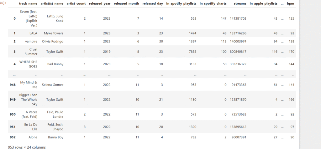
spotify = pd.read_csv(“spotify-2023.csv”, encoding=”ISO-8859-1″)
spotify
First goal is to take a look at the dataset and see what pops out. The various playlists for Spotify, Apple, and others stands out. Also, take a look at the track names, artists, and release years. I wonder if danceability, energy, and other features have an impact on whether or not a song is in the playlist?
Let’s dive deeper!
Using the describe method for mean, max, min, standard deviation, etc.
spotify.describe()
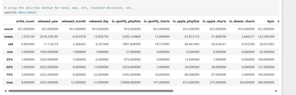
standard describe summary
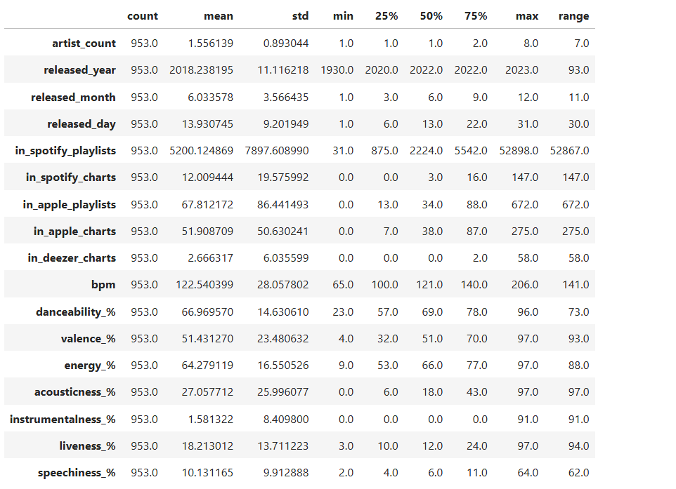
summary = spotify.describe().T # Transpose so columns are rows
helps spot outliers early on. More readability for count, mean, min, etc.
Adding extra info: range (max – min)
summary[‘range’] = summary[‘max’] – summary[‘min’]
summary
Identify null values
spotify.isnull().sum()
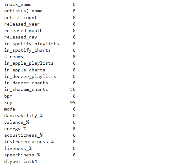
If there are missing values, I’m changing it to 0 meaning it doesn’t show up in the chart.
spotify[‘in_shazam_charts’] = spotify[‘in_shazam_charts’].fillna(0)
Checking the values of the key column before changing the missing values
spotify[‘key’].unique()
array(['B', 'C#', 'F', 'A', 'D', 'F#', nan, 'G#', 'G', 'E', 'A#', 'D#'],
      dtype=object)

Verifying that missing values are gone

spotify['key'].unique()

array(['B', 'C#', 'F', 'A', 'D', 'F#', 'G#', 'G', 'E', 'A#', 'D#'],
      dtype=object)

Checking the data types. If I were doing machine learning, I'd convert the features used to numerical values.
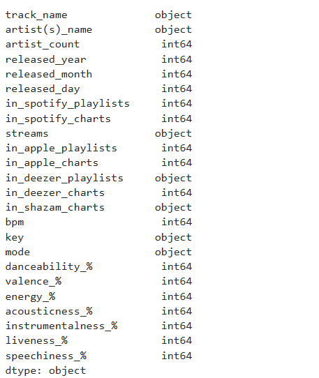
Combining year, month, and day into one data time column.
spotify[‘release_date’] = pd.to_datetime(spotify.rename(columns={‘released_year’: ‘year’, ‘released_month’: ‘month’, ‘released_day’: ‘day’})[[‘year’, ‘month’, ‘day’]])
spotify.dtypes
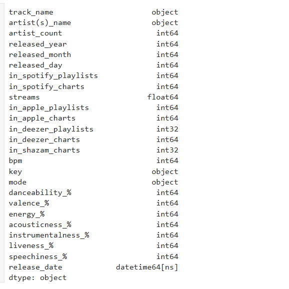
spotify[‘streams’] = pd.to_numeric(spotify[‘streams’], errors=’coerce’)
Checking the unique values in the mode column
spotify[‘mode’].unique()
array(['Major', 'Minor'], dtype=object)

spotify['in_deezer_playlists'] = spotify['in_deezer_playlists'].str.replace(',', '', regex=True).astype(int)

spotify['in_shazam_charts'] = spotify['in_shazam_charts'].str.replace(',', '', regex=True)

# filling missing values with 0

spotify['in_shazam_charts'] = spotify['in_shazam_charts'].fillna('0').astype(int)

For readability I'm changing the column name from artist(s)_name to artist_name.

spotify = spotify.rename(columns={'artist(s)_name': 'artist_name'})

spotify['artist_name']
It’s important to check the dataset throughout to ensure accuracy.
I then checked for any duplicates, there are none.
spotify.duplicated().sum()
0
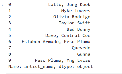
I then checked the spelling of the artists’ names.
spotify[‘artist_name’].head(10)
Exploratory Data Analysis
After some data cleaning it’s time for exploratory data analysis to check for correlations and strong features.
import matplotlib.pyplot as plt
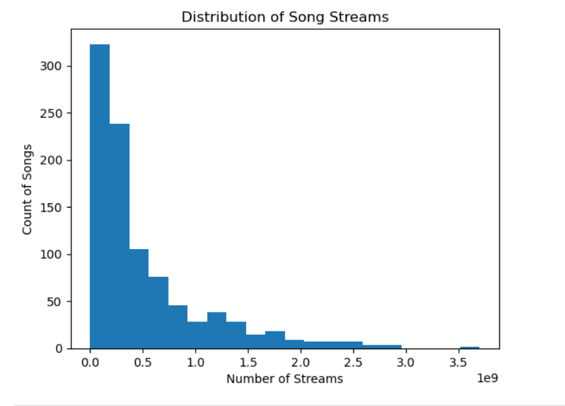
Plot histogram
spotify[‘streams’].plot(kind=’hist’, bins=20)
plt.title(‘Distribution of Song Streams’)
plt.xlabel(‘Number of Streams’)
plt.ylabel(‘Count of Songs’)
plt.show()
Notice how it’s right skewed. This means that the mean is greater than the median.
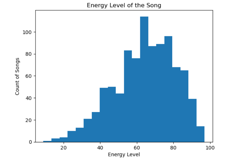
Plot histogram
spotify[‘energy_%’].plot(kind=’hist’, bins=20)
plt.title(‘Energy Level of the Song’)
plt.xlabel(‘Energy Level’)
plt.ylabel(‘Count of Songs’)
plt.show()
Some skew to the left. The mean is less than the median.
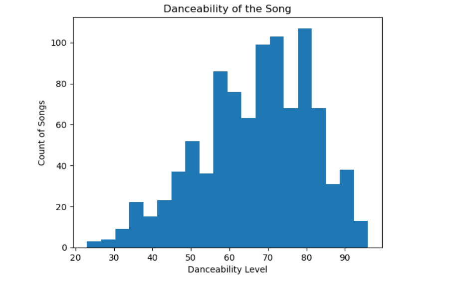
Plot histogram
spotify[‘danceability_%’].plot(kind=’hist’, bins=20)
plt.title(‘Danceability of the Song’)
plt.xlabel(‘Danceability Level’)
plt.ylabel(‘Count of Songs’)
plt.show()
Danceability is more evenly spread across tracks.
import matplotlib.pyplot as plt
List of columns I want to plot
numeric_features = [
‘danceability_%’, ‘energy_%’, ‘valence_%’,
‘acousticness_%’, ‘instrumentalness_%’,
‘liveness_%’, ‘speechiness_%’, ‘bpm’, ‘streams’
]
Looping through each feature and plot
for feature in numeric_features:
plt.figure(figsize=(6,4))
spotify[feature].plot(kind=’hist’, bins=20, edgecolor=’black’) # more bins for detail
plt.title(f'{feature} Distribution’)
plt.xlabel(feature)
plt.ylabel(‘Frequency’)
plt.show()
This gave me various plots for danceability, energy, acousticeness, and more.
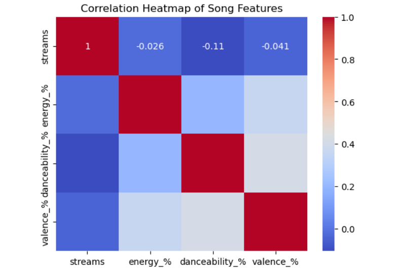
I then created a heat map to check for any correlations.
The results:
– Energy vs Danceability = 0.14 which is a Slight positive correlation
– Danceability vs Valence = 0.13 which is a Slight positive correlation
– Stream vs Danceability = -0.11 which is a Weak negative correlation
import seaborn as sns
import matplotlib.pyplot as plt
Select numerical columns for correlation
numerical_cols = [‘streams’, ‘energy_%’, ‘danceability_%’, ‘valence_%’]
Calculate correlation matrix
corr_matrix = spotify[numerical_cols].corr()
Plot heatmap
sns.heatmap(corr_matrix, annot=True, cmap=’coolwarm’)
plt.title(‘Correlation Heatmap of Song Features’)
plt.show()
Interesting that some songs are from the 30s and 40s! Only one song is from prior to 1940. Notice how Spotify has more songs on playlists than Apple.
avg_playlist_per_release_date = spotify.groupby(‘release_date’)[[‘in_spotify_playlists’, ‘in_apple_playlists’]].mean()
avg_playlist_per_release_date
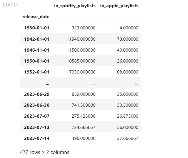
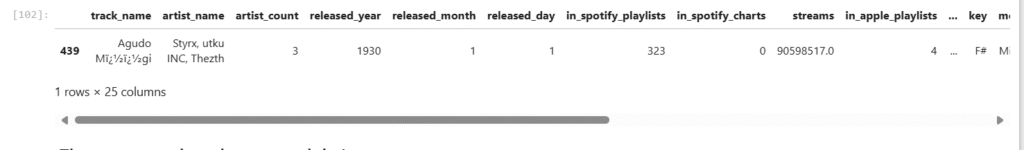
Let’s dig into song/songs from the 30s. Interesting, there is one. It’s in 323 playlists in Spotify!
spotify[spotify[‘released_year’] < 1940]
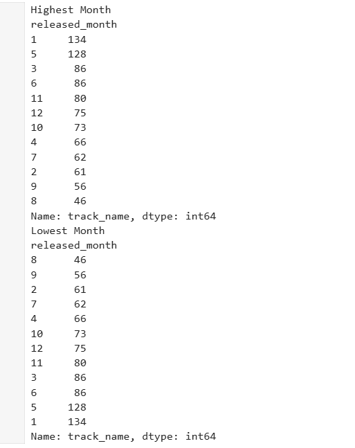
The most popular release month is January
The least popular release month is August
Highest_Month = spotify.groupby(‘released_month’)[‘track_name’].count().sort_values(ascending=False)
Lowest_Month = spotify.groupby(‘released_month’)[‘track_name’].count().sort_values(ascending=True)
print(‘Highest Month’)
print(Highest_Month)
print(‘Lowest Month’)
print(Lowest_Month)
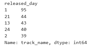
The most popular day is the first of the month.
Highest_Day = spotify.groupby(‘released_day’)[‘track_name’].count().sort_values(ascending=False).head(5)
Highest_Day
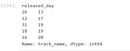
The least popular day is the 26th of each month.
Lowest_day = spotify.groupby(‘released_day’)[‘track_name’].count().sort_values(ascending=True).head(5)
Lowest_day
Next Steps
I’ll have part 3 which is all about Tableau! See the data come to life in an engaging format. I’ll have it linked here when it’s available.
Decide whether or not to do machine learning. If machine learning is the next step I’d encode categorical variable (make them numerical such as key, mode, etc).
Explore time-based playlist trends in more detail.
Build predictive models to determine which features (danceability, valence, playlists, etc). best explain high stream counts.
Lindsay